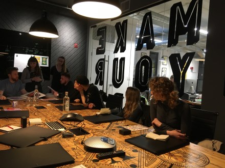
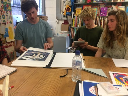
Based on conversations with visual artists during visits to three Mumbai studios, in January this year. An exhibition will also be taking place in the Woodlane library of works by Indian illustrators during February.
Written by Helen Trevaskis, 2nd Year Illustration
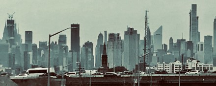
Mumbai is India’s biggest city and the fourth biggest city in the world. As well as being home to Bollywood, one of India’s most famous exports, the mega-city is a hub for visual communications in India, due to the head quarters of most big local and international advertising agencies being located there. Bombay, as most locals still call it, has a growing illustration scene although there are no pure illustration courses in India, and freelancers and studio employees must typically retain a higher degree of flexibility to thrive commercially than visual artists in the UK.

Lokesh Karekar, Founder Locopopo
Lokesh Karekar studied at Sir JJ School of Art, Mumbai, and worked as a visual artist and art director before establishing his own studio Locopopo aged 29. Despite launching one of the first illustration websites in India, he prefers the title visual artist; ‘illustrator’ is too narrow to encompass all his interests. Locopopo works for international and Indian brands, and acts as a platform for Lokesh’s many personal projects. In 2010 Lokesh’s work appeared alongside over 200 artists from around the world in The Ark, an illustrated animal ‘bible’ raising awareness of soon-to-be extinct species. In 2014 Forbes India recognised his rising influence listing him in their 30 under 30.

Sameer Kulavoor, Founder Bombay Duck Designs
Sameer Kulavoor established the studio Bombay Duck Designs which works at the intersection between art, illustration and design. While Sameer is increasingly better known as a painter, like Lokesh who he was class mates with at Sir JJ, he remains one of the best-known commercial illustrators in India. Work that helped him achieve this includes his illustrations for The Ghoda Cycle Project – a collaboration with the clothing brand Paul Smith, and Blued – a self published book on the many uses of taad-patri (an inexpensive bright blue tarpaulin found all over India) by resourceful fellow Indians. Vogue India recently listed him as a mover and shaker in the art world in their 40 under 40 list.

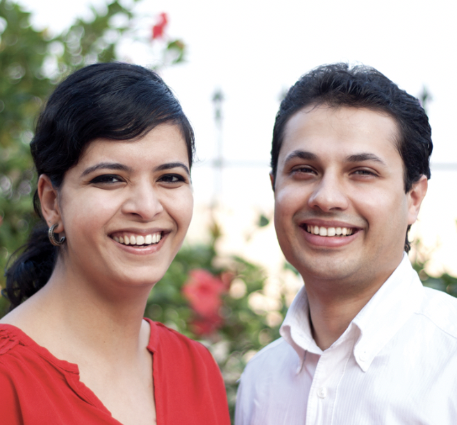
Founder Kahani Designworks Ruchita Madhok with fellow Principal Aditya Palsule
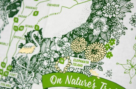
Kahani Designworks was set up by two Mumbai graphic designers who met while studying at University of the Arts London (UAL). Kahani roughly translates as ‘story’ and the studio roots all its work – much of which includes illustration, in a belief that without a narrative there is no meaningful visual communication. Its work divides between work for commercial brands, work for arts organisations and with artists, and its own project and product line Storycity. Storycity is a set of illustrated and annotated maps of Mumbai designed to help locals and foreigners engage in new ways with the megacity, through carefully researched stories that explore its relationships with the sea, nature, history, design and more. Aditya Palsule, Principal and husband of Founder and Principal Ruchita Madhok, was interviewed for this article.
Q: How does India influence your work and the work of your studio?
LK: My work is very much influenced by India. I like to have a modern Indian take so it’s not purely tribal or folk. I also take inspirations from around my world, from Bombay, or Indian styles, which I then try to fine-tune. There are many clients now who want a global style that also keeps an Indian-ness to it.
SK: It happens naturally it’s not a conscious decision. It’s my surroundings, where I am and if I was not here, then I’d be influenced by somewhere else.
Blued (below) especially you can call it Indian.

The book ‘Blued’ by Sameer Kulavoor tells of the many inventive uses of taad-patri (tarpaulin) by Indians
The book happened because I was on the main highway of Bombay at 3am and next to me I saw this huge blue tarpaulined thing. When it over took us I could see it was a helicopter – imagine that! Huge. The sheet of blue was endless. And then I was like, ‘Shit! This needs to be done’. I haven’t done the helicopter drawing but that was how Blued came about. A lot of people say to me, ‘Oh you’re making a project out of poverty’ but it’s not about poverty or economic backwardness.
The use of this blue tarpaulin happens because in India we need to make the most of everything. We don’t have the budgets to repair a roof so we use this material – the quick fix. This use speaks about a lot of other things: how we live, how we think, how we create. There’s a beauty beyond the way it looks and that is inspiring, it’s an amazing display of creativity.
But in the last five-10 years honestly this whole thing of Indian style and Western it’s blurred. Western artists are using Eastern motifs – there’s a lot of cross-pollination.
AP: Ruchita set up Kahani back in 2012 when we returned from working in London. We felt a lot of Indian design then was kitschy and surface led. We believe you need a solid narrative that links all your ideas together. And there is a lot to be gained by looking through local stories, history, local context, ideas that come from local languages – our work is a mix of all those things.
Q: Where do personal and studio projects fit alongside commercial briefs?
LK: I keep telling everyone in the studio, keep doing your own stuff! Create your own bank of ideas, so you can use those ideas in commercial work. Keep evolving them and keep a bank ready. Many works I did for illustration projects were actually from sketches I did. For example one project I did for Taj Hotels, there was a lot of my personal styles that fed into it.
I push everyone in the studio to have their personal taste. Not to do only commercial work. It’s very important to develop what’s very special to you, that comes from within. Unless you are a good artist in your soul you can’t do the commercial work, you can’t express yourself more freely.
It does become slightly difficult to manage both but sometimes the commercial helps my personal and sometimes personal helps my commercial and it’s also an outlet for me to express my own thoughts, my personal stuff.
SK: I started with extremely commercial work. I come from a very basic family and my first intent was to make money. But I always had this thing that I wanted to put out my own work and the form has been evolving over the years. Three-four years ago I started doing lots of paintings. Before it was outlines, typical illustration. Then I started doing more of gouache and painting. It started during a trip to South East Asia I had 40 days off and was making a lot of paintings… And that process was very liberating.
I stopped enjoying these projects where we are given a brief it felt limiting, I had more to say, I wanted to do things very freely. That’s the reason why I’m now painting.

Storycity started as a studio project at Kahani Designworks – each map explores Mumbai through stories
AP: Storycity (above) started as a studio project. We thought it would be one publication and see how it goes but we just had more ideas as we went along.
We were thinking with Storycity how do we engage with the city because it’s such a creative cosmopolitan place. We didn’t want to just do a guide, there are 100s of those. We wanted to see how to something special, visually interesting, with a really well researched set of ideas – so it’s a map of stories. We were particularly looking at links to the sea. A lot of locals don’t realise that the biggest open space Bombay has is the sea – they treat it very badly. Bombay has been carved from the sea. In a way we’re trying to go back to that link, it exists because of the sea and its relationship to where it is and what are all the interesting stories we can find.
Storycity is good to have. It helps keep our team in an experimental mode – it’s kind of our lab! It’s a way to try production techniques, for the team to engage with content better, understand where to find information not just via a Google search. It’s a way of training our team too. And we sell it – if you have an idea it’s going to die if it’s not sustainable! It’s important to see if it can be a viable product.
Q: When a brief comes into the studio, where do you start?
LK: I try to begin from the brief itself. What is the requirement? How can we make it look interesting? I don’t always start from sketching. I often start from giving it thought, what different thing can we do in this brief because every brief will have restrictions. So we brainstorm first…
You need someone to open their mind to work on a project. Execution we all can manage, before that you need to open your mind. Don’t be structured on how to do a project, ‘This should be the process because that’s what we did for the last project’; doing something different for each project automatically brings excitement. We try to do something different so it becomes distinct.
But many times because they (studio team) are very focused on one project it can be hard to get them out of that zone and into something different. A girl here was working on a bed linen brand for one month and then I put her on a kids’ brand and she couldn’t get it! So I had to tell her to go out and go see all the kiddie things, how people approach different kids brands, where kids go, so sometimes you also have to make space to allow people to open their minds.
AP: We are very interested to understand what is the deeper story behind a brief. It’s not just about creating a pretty picture or a fancy logo. If something doesn’t have a narrative it is harder for people to trust it. We always struggle to start off with something where there’s no story, so we try to find a story and then everything comes from there.
Q: Where does your inspiration come from?
LK: So it mostly comes from travelling because then my mind is very relaxed and I can draw. Last year there was an art biennale in Kochi. I saw many things, many art projects. Inspired from that trip I’ve done a set of six cards – it looks abstract, some moments are from that trip some are abstract. It was really interesting to me. I’ve produced 100 copies to sell at design stores.
In the studio on a daily schedule it’s so tight I never get good time for me. Saturdays and Sundays I sketch. I start by looking at the objects around me and also eliminating some objects out and that inspires me a lot.

Lokesh Karekar created this set of cards in response to a visit to the Kochi art biennale
SK: I’m very observant I think. All my work draws heavily from observation, absorbing something and it coming out in a different form – I’m sensitive to what I see. 80% of the stuff that finally goes out starts in a sketchbook or as a small drawing somewhere. And you don’t even know when you’re doing it that this is going to become something! You don’t want to put that pressure on yourself to think about the next project. What really helps is revisiting your sketchbooks now and then.
Also, taking sabbaticals – I spend 50 days a year out of my country, since 2008. After coming to London in 2008 I started making zines. If I get stagnant it works to leave and come back: in a different place a lot of knew things open up. Travelling is probably, a fancy word it’s about getting uncomfortable. I’m fighting stagnancy all the time. The minute I feel it, it bothers me. Others are OK with routine, it’s very personal.
Q: Is it important for an illustrator to find their style, their voice?
LK: I tell people maybe don’t arrive at a style very soon! Right now all the students are very much in a hurry to have their own style. Because style is something that comes from years and years of practise, and drawing and feeling because I see people who pass out of college and have a very fixed idea of style and they can’t change it. This is what I will do for the rest of my life! This makes it very confusing for them to take a different approach in future. Have an open mind before arriving at style. People are very much in a hurry and that’s not the way to work. You can change your style you can do whatever you want. No one restricts you.
SK: That word ‘style’ I find a little strange. It keeps evolving and for me content comes before style – what do I want to tell, what am I doing, then what’s the best way to do it? Everyone is running after wanting to have a style. I don’t approach it like that. Because I know I get bored of doing one kind of thing.
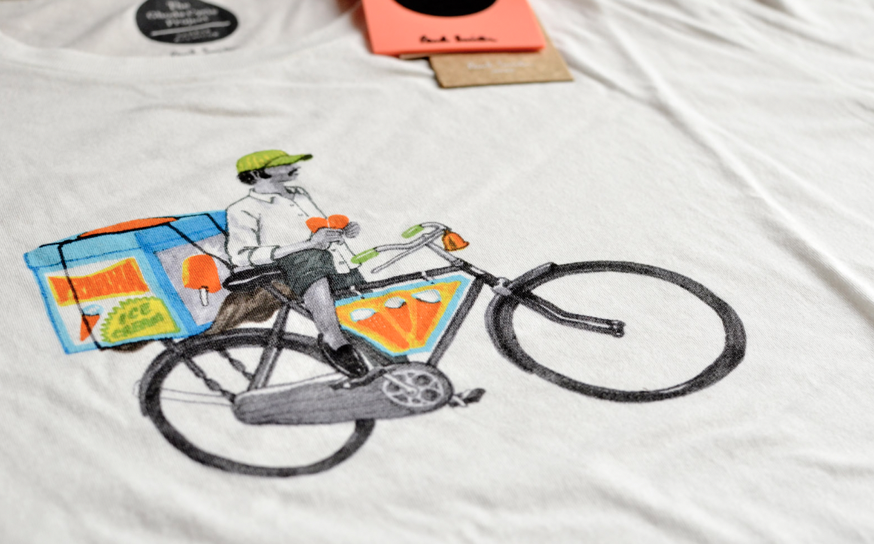
When the Paul Smith four T-shirt collaboration happened – that project got really popular because of the collaboration and got spread on social media – and then for the next one year people kept coming to me saying, ‘Hey I want you to illustrate a bag but in that style’. So that style became like a cosmetic thing that I would have to use whatever I make in life thereon. So I stopped doing that. I did it for six months then I thought, ‘No more felt tip pens!’ Even if it was tough, I just couldn’t keep doing that.

One of the T-shirts created by Sameer Kulavoor for Paul Smith India
I don’t know if they’re stuck, if it’s intentional or that’s the only way some people want to work. And it’s a choice I’m not saying it’s a bad thing. I just don’t think like that. It’s also a good thing, it’s easier for people to hire you if you’re known for a style, but I’m not driven by that.
AP: As an illustrator it’s important to have a voice it’s part of the reason why someone would come to you – they want that voice and style on a project. They like the way you see the world outside, you have something they understand but can’t execute.
But in the studio I wouldn’t say we have a style, there’s definitely an approach to how we look at things but we don’t want to limit ourselves to a particular style. People might approach us to work on something we’ve never worked on before – that happens a lot. Clients are savvy they know they’re hiring the designer or studio for the input they can’t provide, the content, not to replicate a style. Everyone is on-line and looking at different things, trends change quickly and clients understand that.
Q: What other advice do you have for students entering the world of work?
LK: Sometimes it will be better to say, ‘No’. five-six years ago I did a project for a pre-school brand. Then we got another and another and it was all kids’ illustration we were doing in that particular year. So then I didn’t want to do it! It can become your identity and so that kind of work keeps approaching you. It’s very important to break that, saying no to projects which you’ve already done or are very similar. Clients from that same industry approach you because a brand becomes successful and their competitors approach you and ask for it in a similar manner. But you want to do it totally different and it’s hard to tell the client they need something different! It’s hard to get him to understand; you want to given them a direction that’s only for them.
SK: There are two kinds of illustrators in India – the urban kid who is exposed to the internet and a lot of other things and there’s the folk artists holding on to traditions in the villages and there the talent is being passed to one generation from the next – you can see that in Tara books (see below). They are different from each other.

A visual ode to trees and example of illustration inspired by tribal artistic traditions, published by Tara books
The new kid who’s on the internet and social media there are lots of influences… and I just feel that the influence of social media is killing some of the need for originality and the need to work hard. Every new illustrator’s work I see you know it comes from here or there. It tends to get diluted. And it’s so easy to put out work now. People can just reach out to you and talk. Back then it was a big task to get hold of an art director in an advertising agency. A lot of kids get distracted with this easy way of doing self-promotion. That shouldn’t be the driving force.
AP: When you’re starting out fresh out of university go with the flow, try everything out, don’t box yourself in because you never know where something will lead. Always look at something for the long term prospect – how will this help my career develop not how much will this pay me now. In the UK it’s more specialised – you’re an identity designer, you work on brands, but it’s changing and there’s an advantage to fluidity and so staying flexible and collaborative is the way forward.
And do not do things for free! Don’t let yourself to get exploited.

Sameer Kulavoor, Founder Bombay Duck Designs

Lokesh Karekar, Founder

Founder Kahani Designworks Ruchita Madhok with fellow Principal Aditya Palsule

The book ‘Blued’ by Sameer Kulavoor tells of the many inventive uses of taad-patri (tarpaulin) by

Storycity started as a studio project at Kahani Designworks – each map explores Mumbai through

A visual ode to trees and example of illustration inspired by tribal artistic traditions, published by Tara books

One of the T-shirts created by Sameer Kulavoor for Paul Smith India

Lokesh Karekar created this set of cards in response to a visit to the Kochi art biennale


![photo 5[1]](https://i0.wp.com/falmouthillustrationblog.com/wp-content/uploads/2017/05/photo-51.jpg?w=142&h=142&crop=1&ssl=1 "photo 5[1]")

![photo 4[1]](https://i0.wp.com/falmouthillustrationblog.com/wp-content/uploads/2017/05/photo-41.jpg?w=142&h=142&crop=1&ssl=1 "photo 4[1]")
![photo 3[1]](https://i0.wp.com/falmouthillustrationblog.com/wp-content/uploads/2017/05/photo-31.jpg?w=142&h=142&crop=1&ssl=1 "photo 3[1]")

![photo 1[1]](https://i0.wp.com/falmouthillustrationblog.com/wp-content/uploads/2017/05/photo-11.jpg?w=142&h=142&crop=1&ssl=1 "photo 1[1]")


